The Force-Velocity Curve of Exercises Curves like this are taken as...

Dan Cleather | Strength and Conditioning@dr_jump_uk
23 views
Dec 17, 2025
~1 min read
Advertisement
1
The Force-Velocity Curve of Exercises
Curves like this are taken as gospel, but are complete BS.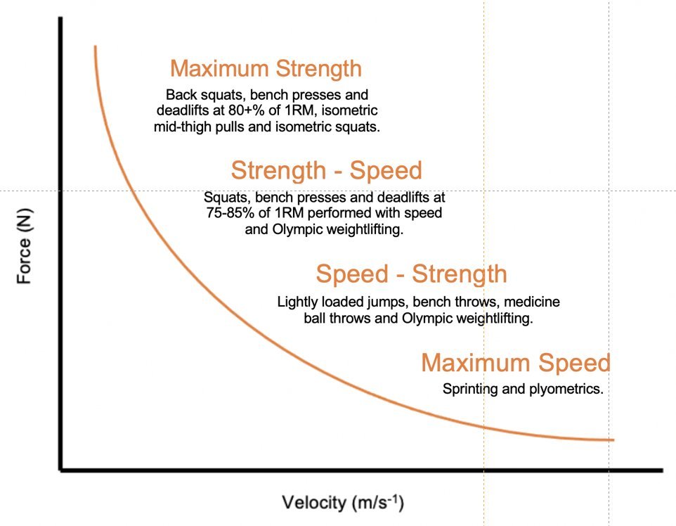
Curves like this are taken as gospel, but are complete BS.
2
I was pretty disappointed with myself when I realised that I had been accepting these types of curves uncritically. Its pretty straightforward to see that this type of classification doesn't make sense.
3
Let's start with the maximum speed part of the curve. According to the graph this is high velocity and low force. But sprinting is very high force. Usain Bolt has a peak force of 3,600N through 1 leg.

4
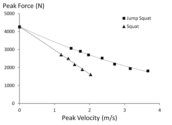
Now look at speed strength. An example of this is lightly loaded jump squats which (according to the curve) should be higher velocity and lower force. But this is contrary to the research - jump squats are both higher force and higher velocity than squatting.
5
Finally, let's talk about strength-speed. An example of this is Olympic weightlifting which is said to be higher velocity and lower force than a maximum strength exercise like squatting. Again, this is likely not true. Force in OL is probably at least as high as in squatting.
6
The curve would probably make sense if we changed the y-axis from "force" to "applied external load". This isn't just semantics. As we have seen, just because the load is smaller it doesn't mean the force production requirements are also lower.
7
This conflation of force with load is common in S&C. It is a critically important misunderstanding as it leads coaches to not fully appreciate the importance of force production.
8
@LouisHowe_SandC But then we need to factor in the actual behaviour at the joint. For instance, if the moment arm changes it would weaken any relationship coming from the fibre level.
