HOW TO EMULATE CEL ANIMATION IN DIGITAL ART: A 🧵 (Starring Kei from...

rick "sanchez" dias@Cumgyattler_V
67 views
Nov 12, 2025
~3 min read
Advertisement
1
HOW TO EMULATE CEL ANIMATION IN DIGITAL ART: A 🧵 (Starring Kei from Dirty Pair)

2
This is a tutorial guide on how to emulate the aesthetic of analog-era anime. I assume that *you*, the person reading this thread are already knowledgeable in the principles of art such as line, shape, form, etc. and thus can competently draw things like humans or machines.


4
I recommend this over than just grabbing random screenshots because often times a show’s official release will suffer from inaccurate colours due to film rot or a bad transfer. Dragon Ball is a rather frequent victim of this.
5
But now with that out of the way, we can get onto the actual process. As we all know, cel anime involves drawing on layers. Characters are inked on sheets, with the colour applied on the opposite side flipped over.
6
Because it’s a process done by-hand, I recommend using bleeding ink brushes and to apply pen-pressure as it gives the drawing a more varied line weight.
My art program of choice is Procreate, but this guide should apply to programs like Photoshop and Clip Studio Paint.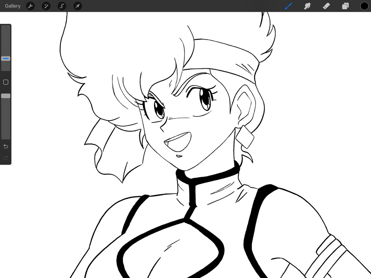
My art program of choice is Procreate, but this guide should apply to programs like Photoshop and Clip Studio Paint.
7
For colouring and shading, this part is pretty dependent on what "era" you’re interested in replicating. As the three-toned shading often associated with celluloid anime are usually found in higher budgeted OVA’s or films compared to television.


8
Works from the 70’s *rarely* use any shading, if at all! Often they’ll simply rely on the heavy inking to create depth. It’s a lot less common than you’d think. But from the late 80’s onward it’s expected that your characters have a darker tone for the shadows.

9
Here’s "80's TV Kei" and "90's OVA Kei" for those interested in understanding the difference when adding another layer of shading.


10
Once you’re done rendering your respective character, merge your layers together then create a copy positioned underneath.
That copy will have its brightness and saturation be lowered down to pitch black. Using "Gaussian Blur", it’ll become the drop shadow.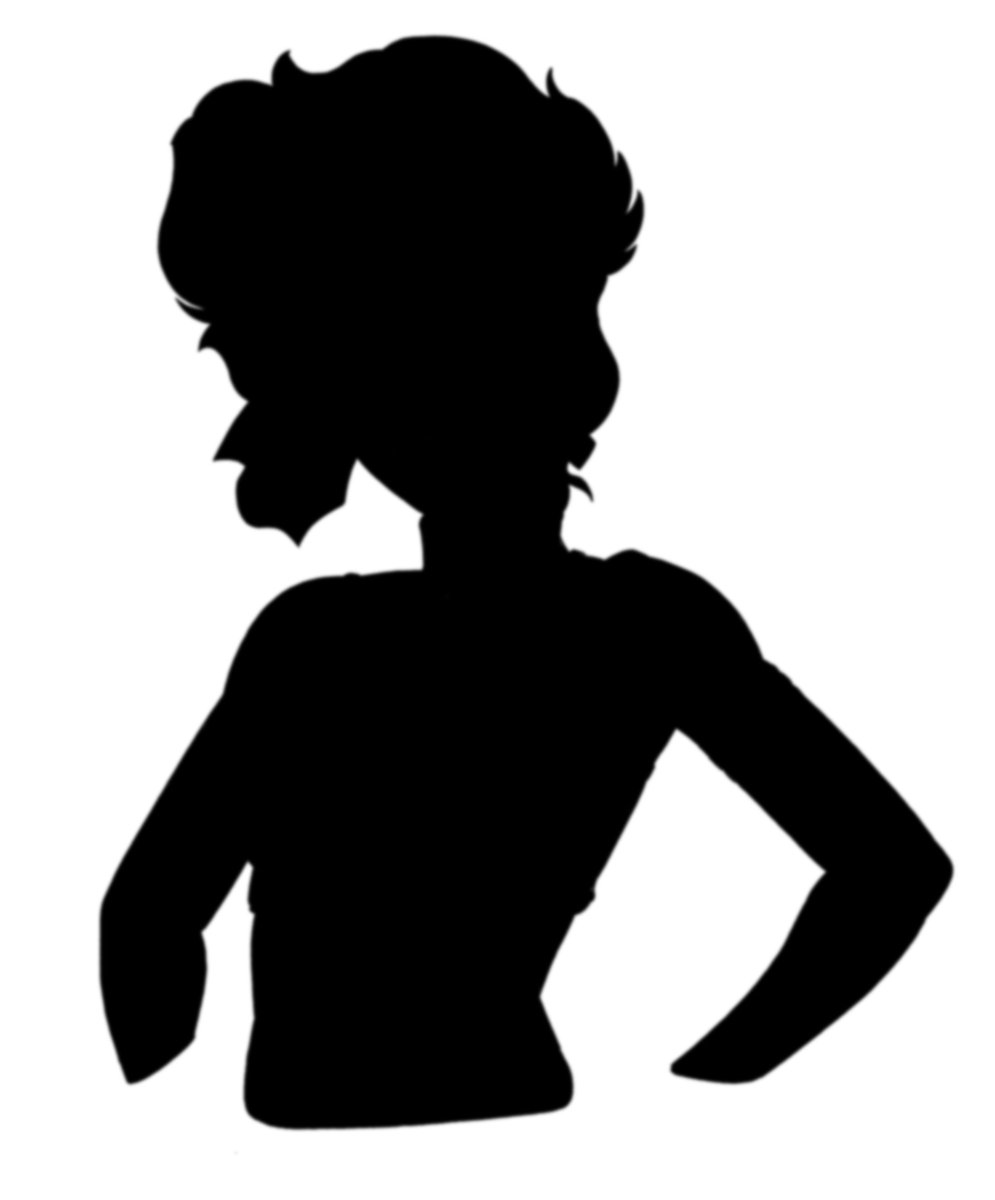

That copy will have its brightness and saturation be lowered down to pitch black. Using "Gaussian Blur", it’ll become the drop shadow.
11
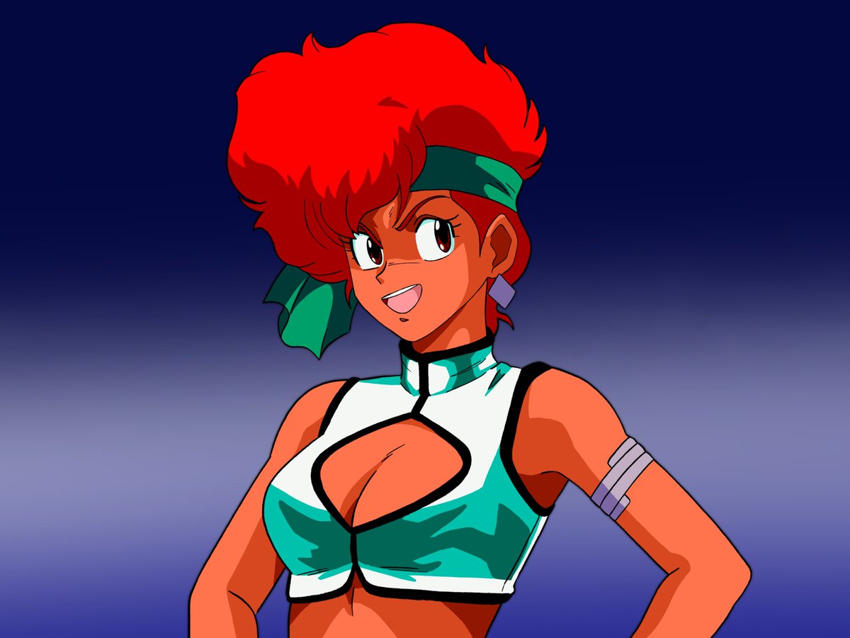
Next, paint your background! Complexity is entirely dependant on you, but try and use oil paint or watercolour brushes if you’re aiming for authenticity. Your canvas should typically be 4:3, as that was the common aspect ratio for the time.
12
That should be it. But if you wanna go the extra mile, add a layer of noise to serve as film grain. Next, slightly blur your image before adding chromatic aberration. Sharpen, then duplicate your image. Slide your dupe a few inches left. Lower its opacity by about sixty percent.
13
What this’ll do is give the illusion of "ghosting". Afterwords, shift the hue and saturation to your liking. Whichever matches the look of what you’d find on a Laserdisc or VHS.
And viola! A mockup straight from your local Blockbuster… back when those were culturally relevant.
And viola! A mockup straight from your local Blockbuster… back when those were culturally relevant.
14
Of course, you can always push it further depending on what you’re aiming for. Such as including dust and dirt marks, compressing the image’s resolution or even adding a VHS filter overlay.
Here are some examples of my own which demonstrate this:


Here are some examples of my own which demonstrate this:

