[FULL GUIDE] Optimize Your Landing Page “Above The Fold” For More Buyers & Subscribers

The single most valuable piece of digital real estate:

Your landing page “above the fold.”
100% of visitors to your website see this section. But most people spend almost no time optimizing it, which means they lose hundreds of buyers and subscribers without even knowing.
Recently, I’ve noticed more and more high-level marketers running absolutely dialed-in above the fold sections. And the reason is simple: AI has made it dramatically easier to optimize, as long as you know what “good” looks like.
So today I want to share the exact workflow I used to take our above the fold from the image on the left, to the image on the right, in under 15 minutes, using AI.

We’re going to cover:
And if you want a full guided AI walkthrough of how to do each of these steps, I’ve created a full guided walkthrough AI prompt to help you with everything we cover today. You can find it linked at the bottom of this article.
Now let’s get into it.
What Is “Above The Fold” For A Website?
The word above the fold comes from classic print newspapers.
Given newspapers were folded vertically, the front cover was split between above the fold and below the fold. The job of the newspaper editors was to optimize the above the fold so that readers could see the day’s headlines inside the newspaper stand or on top of the stacked papers. The better the above the fold, the more newspaper buyers.

That term has been adapted now for websites. Above the fold on a landing page is simply what is shown on the screen before someone scrolls. And just like newspapers, an optimized above the fold increases the likelihood the visitor engages with the website in some way.

Why You Should Optimize Your Above The Fold
Your above the fold section is the only place on your website that 100% of your visitors see. Compare that to ~20% of visitors who scroll even halfway down the page, let alone the bottom. Because of this, the above the fold is the only part of a website worth obsessing over. If you can nail that part, conversion on the page will go up without changing anything else.
Also, when optimized, your above the fold can do the job of your entire landing page in a single frame. If a visitor can get every answer they need without scrolling, they don’t even need to scroll. They just buy.
So that is our goal. For the only place on our website that 100% of our visitors see, how can we give them all the information they need and nothing else?
Before we get into the tactics of how to do it right, let’s quickly run through the most important mistakes to avoid.
3 Common Above The Fold Landing Page Mistakes
Mistake #1: Not Optimizing For Mobile
Most people design their landing pages on desktop. As a result, they end up designing it with desktop in mind, rather than mobile.
But this is the wrong way to do it. Just because something looks good on desktop does not mean it will automatically look good on mobile.
At this point, more than 60% of global web traffic now comes from mobile. And that number is even higher for digital-focused businesses that generate traffic from social media (which I’m guessing is what you do if you’re reading this). So you need to be thinking mobile first.
For example, we recently optimized our Start Writing Online sprint landing page. The website looked awesome on desktop, but when I popped open the mobile version, this is what I saw.

No good!
And this is what sent me down the rabbit hole of above the fold optimization.
So to prevent making the same mistakes I did, you need to design things mobile-first.
To do this, I first recommend installing the Mobile Simulator Chrome Extension for an easy 1-click “view as mobile” option.
And second, I recommend building out your landing pages using the mobile version of the design editor for your website builder. That way, mobile is the priority rather than an afterthought.
Mistake #2: Forcing A Scroll To Gather Any Info
Every action you force a reader to take will reduce your conversion rate.
For example, look at the unoptimized version again.

The visitor has to scroll just to figure out what the thing is.
Some will scroll, but don’t mistake this for “curiosity.”
For every person who does scroll to find the information, most others leave before doing anything. These aren’t uninterested visitors, they just have short attention spans & didn’t want to hunt for information.
So the goal of your above the fold is to make sure they can get as much information as possible without scrolling at all.
Mistake #3: No Immediate Action Buttons To Skip The Scroll
Lastly, you want to make it easy for a reader to either:
If you make it hard to do either of these things, your conversions will go down.
So instead, you want to set up easy buttons for them to click to do either of these things.
So with these mistakes top of mind - how do we avoid them?
It starts with answering these 10 questions.
The 10 Questions Your Above The Fold Needs To Answer
An optimized above the fold answers:
The goal is for the visitor to see everything they need to know about your product without a single scroll. Then, if they need more information on a certain section, they can find it by scrolling deeper down the landing page. But the goal is to pretend this is the only place you can communicate with the visitor, and optimize it accordingly.
When a new visitor visits your landing page, they have a handful of questions that they need answered. If you can clearly answer them, without them having to hunt for the information, the likelihood goes up that they take the next step you recommend.
So with that in mind, what questions should you answer?
After studying hundreds of above the fold landing pages, the best ones answer these 10 questions:
If you take a look at your current landing page’s above the fold section, how many of these does it answer?
Compare that to our optimized version, where every single word on the page is intentionally placed to answer one of these questions.

Now that we know what we’re optimizing for, let’s walk through how to do it.
(And one aside - these questions can also be the template for each “section” of your landing page. The goal of your above the fold is to summarize each of those sections in one screenshot. Then, if the reader needs more information, they can find it in the full section underneath.)
3 Steps To Overhaul & Optimize Your Above The Fold Using AI
To optimize your above the fold, you are going to:
Let’s walk through each one.
Step 1: Answer The 10 Questions For Your Product
First, take these 10 questions and answer them clearly for your product.
This will give AI the raw material it needs to do the optimization. Be concise & clear with your answers, otherwise you risk bloating things with too much information.
Step 2: Generate An Optimized Above The Fold Mockup With AI
With your 10 questions answered, you are going to build a mockup image.
To do that, my preferred workflow is to:
The output of this step should be a nicely-designed above the fold mockup image, like this:
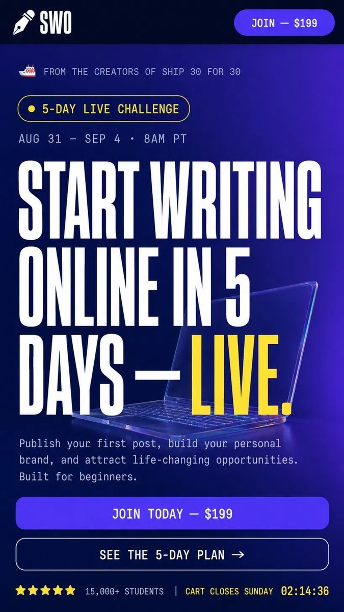
From here, you can give it feedback to tweak certain elements and move things around. Don’t expect it to be perfect on the first try, but recognize how long this would have taken to build manually! This shortcuts the work by ~90% and lets you simply communicate stylistic changes.
Do this until you like what you see. From here we’re going to turn it into HTML.
Step 3: Update Your Landing Page HTML To Match The Mockup
The last step is to tweak the HTML of your current landing page and replace it with this more-optimized version.
Depending on the platforms you are using, the steps will look different.
If you’re using custom HTML, you can have AI rewrite it directly.
The simplest version is to upload your current HTML file and the mockup image and say “Rewrite the mobile above the fold section of this landing page to match the mockup image.” Then you can give it feedback the same way you would talk to a designer if it’s not just how you like it.
Once you’re happy with it, push it live to whatever hosting setup you’re using.
If you’re using some other custom website builder, your steps will be different. You can either download the current HTML, tweak it using the steps above, and then reupload it as custom HTML. If you’re not sure how to do that part, just say “I’m using [your platform] - how do I update my landing page with this HTML?” and it will walk you through it.
And that’s the full workflow! Answer the 10 questions, generate a mockup image, and update your HTML. The whole thing takes 15 minutes once you know the framework.
[FREE WALKTHROUGH GUIDE] Optimize Your Above The Fold In 15 Minutes

If you made it this far, you might be thinking:
“I want to do this, but I don’t want to start from scratch.”
I’ve put together 3 prompts that walk you through each step of the workflow above, so all you have to do is paste and follow along.
Here’s what you get:
All I ask is that you like & bookmark this post if you found it valuable, so more people can find it.
And if you have any other questions about anything we covered today, please leave a comment to let me know. I read and reply to every single one of them.
I hope you found this piece valuable.
Talk soon,
Dickie
PS: If you want a full guide to start writing online (so more people will end up visiting your website), here's a free 13,000-word ultimate guide to get started.
