Create custom components w/ @lovable. Process + Result Prompt in...

damien@damienghader
50 views
Aug 17, 2025
~2 min read
Advertisement
1
Create custom components w/ @lovable.
Process + Result Prompt in thread 🧵
Process + Result Prompt in thread 🧵
2
1/ Let's break down the process into 6 steps.
👇#6 for the full ready-to-use prompt.
👇#6 for the full ready-to-use prompt.
3
2/ Personal Prompt Helper
Tell gpt-4o what you’re aiming for, use reference images:
“Make me a Lovable prompt to design a beautiful UI component set from scratch in Lovable. I want a Liquid Glass aesthetic with soft blur, glowing edges, and interactive depth.”
Iterate your prompt quickly with gpt.
This gives you a great starting point and "template" before diving into design specifics.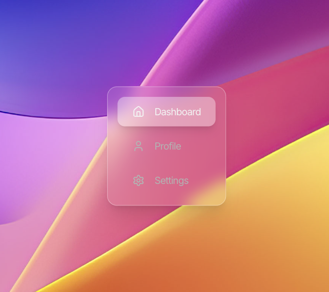
Tell gpt-4o what you’re aiming for, use reference images:
“Make me a Lovable prompt to design a beautiful UI component set from scratch in Lovable. I want a Liquid Glass aesthetic with soft blur, glowing edges, and interactive depth.”
Iterate your prompt quickly with gpt.
This gives you a great starting point and "template" before diving into design specifics.
4
3/ Styling System
Liquid Glass Inspired:
– bg-white/10 to bg-white/20 transparency
– backdrop-blur-md (or stronger) for blur
– Iridescent border gradients
– shadow-xl with blur & spread for depth
– Prismatic glow on hover (optional)
Liquid Glass Inspired:
– bg-white/10 to bg-white/20 transparency
– backdrop-blur-md (or stronger) for blur
– Iridescent border gradients
– shadow-xl with blur & spread for depth
– Prismatic glow on hover (optional)
0:05
5
4/ Universal Attributes
Give your component sets consistency.
Make everything feel cohesive:
– Inter font, regular weight, -5 letter spacing
– Unified rounded-2xl border radius
– White & dark mode support
– Matched spacing, sizing, and padding
Give your component sets consistency.
Make everything feel cohesive:
– Inter font, regular weight, -5 letter spacing
– Unified rounded-2xl border radius
– White & dark mode support
– Matched spacing, sizing, and padding
6
5/ Animations & Interactions
Small, simple details that make it feel alive:
- Hover: scale-105 for subtle lift
- Cursor shimmer: adds depth to cards, graphs
- Page loads: animate-fadeIn, smooth transitions
Small, simple details that make it feel alive:
- Hover: scale-105 for subtle lift
- Cursor shimmer: adds depth to cards, graphs
- Page loads: animate-fadeIn, smooth transitions
0:01
7
6/ Final Prompt
"Create a premium UI component set called “Liquid Glass”.
Design direction: futuristic, ultra-clean, inspired by Apple VisionOS and luxury SaaS dashboards.
Apply these styles:
– bg-white/10 to bg-white/20 transparency
– backdrop-blur-md or stronger
– Iridescent gradient borders
– shadow-xl with depth and soft blur
– Optional prismatic glow on hoverTheme rules:
– Use Inter font, regular weight, -5 letter spacing
– White & dark mode support
– rounded-2xl border radius
– Keep all sizing, padding, and spacing consistent
Add micro-interactions:
– scale-105 on hover
– Ripple/wave animation on click (for buttons)
– Cursor shimmer effect for cards and graphs
– Smooth transitions on load (animate-fadeIn, etc.)
Components should feel fluid, modern, and award-winning.
Start with a nav bar, toggle switch, card, and tab menu to show the full system.
Do not use placeholder content — keep it polished and clean."
Include your reference image as well.
"Create a premium UI component set called “Liquid Glass”.
Design direction: futuristic, ultra-clean, inspired by Apple VisionOS and luxury SaaS dashboards.
Apply these styles:
– bg-white/10 to bg-white/20 transparency
– backdrop-blur-md or stronger
– Iridescent gradient borders
– shadow-xl with depth and soft blur
– Optional prismatic glow on hoverTheme rules:
– Use Inter font, regular weight, -5 letter spacing
– White & dark mode support
– rounded-2xl border radius
– Keep all sizing, padding, and spacing consistent
Add micro-interactions:
– scale-105 on hover
– Ripple/wave animation on click (for buttons)
– Cursor shimmer effect for cards and graphs
– Smooth transitions on load (animate-fadeIn, etc.)
Components should feel fluid, modern, and award-winning.
Start with a nav bar, toggle switch, card, and tab menu to show the full system.
Do not use placeholder content — keep it polished and clean."
Include your reference image as well.
