Notice how logos recently all look the same?
Not because it makes them look better...
But because of THIS psychological trick that manipulates your brain.
That's why Google, Microsoft, and Airbnb are all doing it.
Here's the full explanation:🧵

Your brain has a secret weakness.
Big Tech discovered it by accident.
Now Google, Microsoft, and PayPal are exploiting it to control how you think about their brands.
The science behind it is both brilliant and terrifying:
Big Tech discovered it by accident.
Now Google, Microsoft, and PayPal are exploiting it to control how you think about their brands.
The science behind it is both brilliant and terrifying:

VIDEO
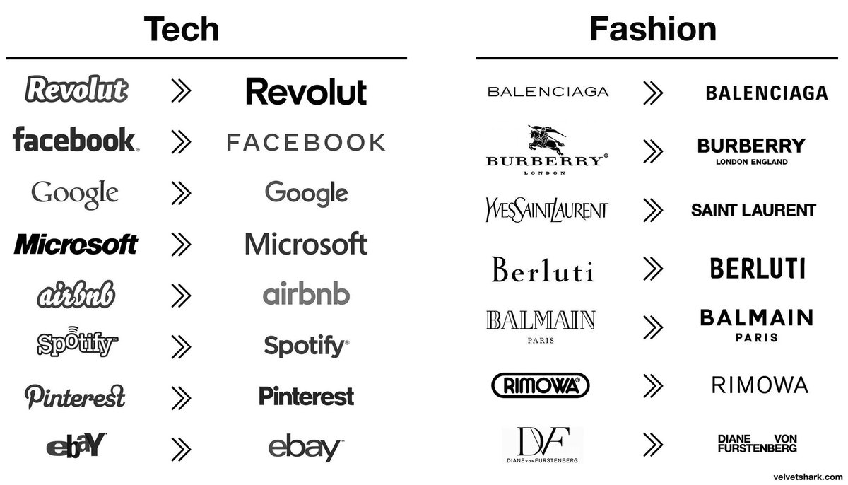
Look closely at these new logos.
They're not just simpler - they're starting to look eerily similar.
Sans-serif fonts. Basic shapes. Limited colors.
It's like they're all following the same hidden playbook.
But why? The answer lies in human psychology:
They're not just simpler - they're starting to look eerily similar.
Sans-serif fonts. Basic shapes. Limited colors.
It's like they're all following the same hidden playbook.
But why? The answer lies in human psychology:

VIDEO
Before we continue, I want to thank @meetgamma for partnering with me on this post.
50M+ users are already using Gamma not only to create AI presentations, but also websites, social media content, documents, and more.
🔗 gamma.app
50M+ users are already using Gamma not only to create AI presentations, but also websites, social media content, documents, and more.
🔗 gamma.app

VIDEO
Our brains process visuals 60,000 times faster than text.
And here's the fascinating part:
The simpler the visual, the faster we process it.
This is why companies are racing to simplify their logos. But there's more to this story...
And here's the fascinating part:
The simpler the visual, the faster we process it.
This is why companies are racing to simplify their logos. But there's more to this story...

Take Google's evolution:
1999: Complex, shadowed text
2010: Glossy, 3D effect
2015: Flat, sans-serif font
Each iteration got progressively simpler.
The result?
1999: Complex, shadowed text
2010: Glossy, 3D effect
2015: Flat, sans-serif font
Each iteration got progressively simpler.
The result?

VIDEO
42% of consumers perceive brands with modernized logos as more trustworthy.
Microsoft followed a similar path:
• Removed all gradients
• Eliminated shadows and depth
• Switched to basic geometric shapes
But the real genius? These weren't just aesthetic choices...
Microsoft followed a similar path:
• Removed all gradients
• Eliminated shadows and depth
• Switched to basic geometric shapes
But the real genius? These weren't just aesthetic choices...
These changes were driven by the digital revolution.
Logos today need to work across dozens of platforms:
Think tiny app icons. Social media profiles. Website headers.
And that's just online.
The rise of wearables (e.g. Apple Watch) accelerated this trend...
Logos today need to work across dozens of platforms:
Think tiny app icons. Social media profiles. Website headers.
And that's just online.
The rise of wearables (e.g. Apple Watch) accelerated this trend...
Complex logos break down at small sizes.
Gradients become muddy.
Detailed illustrations blur.
Fine text becomes unreadable.
This is why Airbnb made a controversial decision in 2014:
Gradients become muddy.
Detailed illustrations blur.
Fine text becomes unreadable.
This is why Airbnb made a controversial decision in 2014:
They scrapped their casual script font for the "Bélo" symbol.
A simple, continuous line forming a unique shape.
The internet erupted in mockery - comparing it to various body parts.
But Airbnb knew something critics didn't:
A simple, continuous line forming a unique shape.
The internet erupted in mockery - comparing it to various body parts.
But Airbnb knew something critics didn't:

Their old logo was failing in the digital age:
• Hard to animate
• Illegible at small sizes
• Inconsistent across platforms
It was difficult to remember.
The new logo, despite initial backlash, solved all these problems.
Here's where it gets interesting:
• Hard to animate
• Illegible at small sizes
• Inconsistent across platforms
It was difficult to remember.
The new logo, despite initial backlash, solved all these problems.
Here's where it gets interesting:

The human brain has a preference for simple shapes.
We're hardwired to remember:
• Straight lines over curves
• Circles over complex polygons
• Basic patterns over intricate designs
75% of consumer perceptions are influenced by simple shapes and colors.
So:
We're hardwired to remember:
• Straight lines over curves
• Circles over complex polygons
• Basic patterns over intricate designs
75% of consumer perceptions are influenced by simple shapes and colors.
So:
They needed logos that could:
• Be instantly recognizable
• Cut through the noise
• Work at any size
• Be memorable
• Load quickly
This led to an unexpected consequence:
• Be instantly recognizable
• Cut through the noise
• Work at any size
• Be memorable
• Load quickly
This led to an unexpected consequence:
As logos became simpler to meet these requirements, they started looking more alike.
It's not laziness or lack of creativity.
It's evolution.
Just like animals evolving similar features to survive in the same environment.
It's not laziness or lack of creativity.
It's evolution.
Just like animals evolving similar features to survive in the same environment.
This trend isn't slowing down.
More companies are simplifying their logos every year.
Because in a world of infinite content and shrinking attention spans, simplicity isn't just beautiful.
It's survival.
More companies are simplifying their logos every year.
Because in a world of infinite content and shrinking attention spans, simplicity isn't just beautiful.
It's survival.

The psychology behind these logo changes reveals something profound:
In a world of information overload, simplicity wins.
The way companies communicate with their customers is changing.
But this principle extends far beyond just logos...
In a world of information overload, simplicity wins.
The way companies communicate with their customers is changing.
But this principle extends far beyond just logos...
There's another way the most successful founders are simplifying their message to cut through the noise.
They're building personal brands.
Why?
Because today, people trust people — not the AI generated, corporate speak we've become used to.
They're building personal brands.
Why?
Because today, people trust people — not the AI generated, corporate speak we've become used to.
That's the Wrap up🤩
If you found this helpful!
👉 Repost and share with your Network!
Follow me @riyazmd774 for more useful content.
If you found this helpful!
👉 Repost and share with your Network!
Follow me @riyazmd774 for more useful content.
View Tweet
Generated by Thread Navigator
Press ⌘ + S to quick-export