Thread Truncated (Cap Enforced)
Only the first 20 tweets are unrolled into slides to ensure reliable PDF exporting and high server performance.
Canvas & Ratio
Choose your destination platform format
Layout Template
Choose a content structure for your slides
Preset Themes
Typography & Sizing
Brand Kit Customization
AGENCYConfigure brand assets for headers & footers
Outro Slide CTA
Customize your closing call-to-action slide
Background Pattern
Build Your Carousel
Drag and drop any post card below onto a slide, or use the quick buttons to insert content/images instantly!

I want to take a few minutes to respond to statements made by Max Roser, the director of OWID. I hope this will be helpful and constructive for all involved.
First, I want to apologize for having hurt Roser’s feelings. I could have chosen more diplomatic language at times, and I will take better care in the future. I also want to make it clear that my disagreement with him is not personal. It is empirical.
OWID is a valuable site, and we all appreciate the data they’ve made available. But it is also a powerful media platform, with powerful funders. It sets public narratives, which we should be able to critique if warranted on empirical grounds.
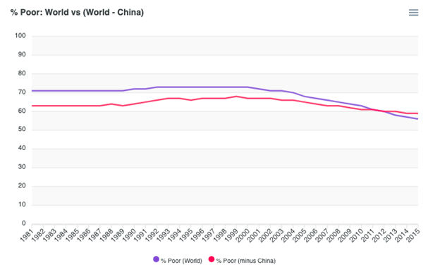
One of those narratives has to do with global poverty, based on a particular graph that Gates, Pinker and several think tanks have politicized over the past few years.
The main problem with the graph is that it presents a simple story to the public that flattens significant empirical debates among academics. A number of critiques have been made in the past. I have drawn attention to two in particular:
First, the pre-1981 trend is based on GDP data that is not useful for assessing poverty, because (unlike World Bank household surveys) it does not adequately capture changes in household consumption from subsistence and commons.
This is a problem, because during periods of dispossession and enclosure, such as under colonialism and early industrialization from 1500 on, GDP may increase even while people’s access to subsistence and commons is severely constrained.
Roser is correct that framing this as a matter of commodity vs non-commodity production is overly generalizing. The problem is more complex than that. Here is some of what’s at stake: <a target="_blank" href="https://www.globalpolicyjournal.com/blog/11/02/2019/global-poverty-over-long-term-legitimate-issues" color="blue">globalpolicyjournal.com/blog/11/02/201…</a>

Recent scholarship raises several other issues that create discrepancies between measurements that rely on GDP data and measurements that assess poverty more directly. This casts the the historical trend into question: <a target="_blank" href="https://1lib.uk/book/11926264/191b2c" color="blue">1lib.uk/book/11926264/…</a>
I've argued that, in general, poverty likely worsened during periods of enclosure and colonization, and declined with the rise of labour movements, democracy and decolonization. Unfortunately, this complexity tends to get obscured in the dominant narrative.
The second problem has to do with the period from 1981, when the World Bank’s poverty data begins. Relying on a threshold of $1.90 per day gives the impression of extraordinary progress against poverty when the reality is not so rosy.
The $1.90 line is useful for some purposes, but the empirical literature is clear that this amount of money is not adequate for basic nutrition, much less meeting other essential needs. <a target="_blank" href="https://www.ohchr.org/EN/Issues/Poverty/Pages/parlous.aspx" color="blue">ohchr.org/EN/Issues/Pove…</a>
We know that people need closer to $7.40/day in order to achieve decent nutrition and health. The number of people living under this line is higher today than in 1981, and the decline in the poverty ratio has been inadequate. We have to face up to this reality.

Noah Smith tries to claim that we don’t acknowledge incomes rising over low thresholds. In fact we do (see link). The point is that it’s not enough to lift most people out of actual poverty: <a target="_blank" href="https://www.cgdev.org/blog/12-things-we-can-agree-about-global-poverty" color="blue">cgdev.org/blog/12-things…</a>
This is not controversial. In fact, Roser and I agree on this. Aside from the Gates graph, he and OWID have developed excellent visualizations showing various poverty lines, with results in relative and absolute terms.
As for Smith’s points about industrial policy: I agree with many of them (!), although with a few important differences. I will write a post on this later, on the role of industrial policy in achieving progress in the 21st century.
The point is that poverty persists. Half of humanity lives on an average of $3.38/day. This is not an accident; it is the result of an economic system that still systematically exploits the lands and bodies of the South for the enrichment of the North.
My critiques of the OWID graph have never been intended as personal attacks on Roser. I have mentioned him as the creator of the graph, and quoted his claims, but my arguments have been focused on empirical matters. I have nothing against him as a person.
When we’ve corresponded, I’ve affirmed that this is not personal – that I appreciate OWID and Roser’s broader contributions, and that this is a question about one prominent graph among hundreds that OWID has published.
Roser objects to a headline the Guardian used for my work: I absolutely agree with him – it was far too simplistic. I didn’t choose the headline, and I asked them to change it. I regret that this contributed to unnecessary polarization.