Canvas & Ratio
Choose your destination platform format
Layout Template
Choose a content structure for your slides
Preset Themes
Typography & Sizing
Brand Kit Customization
AGENCYConfigure brand assets for headers & footers
Outro Slide CTA
Customize your closing call-to-action slide
Background Pattern
Build Your Carousel
Drag and drop any post card below onto a slide, or use the quick buttons to insert content/images instantly!

hi all! here are some design tips and tricks i use when planning out how to decorate an area, based on interior design tips! i hope it helps map out some of my thought process in a way that isn't too confusing!

⠀⠀⠀⠀⠀ ⠀⠀⠀⠀⠀1. THEME the first thing i do is pick a theme for an area. most people will already know they want an area to look rustic, spooky, etc. this decision will inform my item choices. uniform theme prevents clashing elements! ⠀⠀⠀⠀⠀
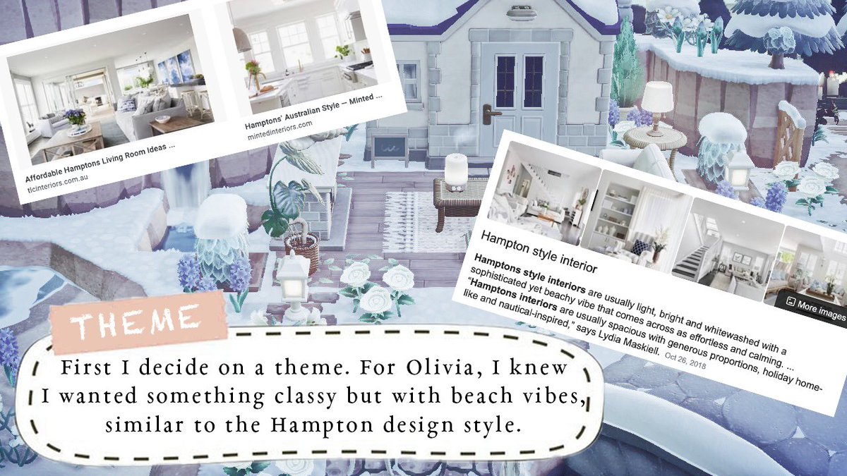
BONUS TIPS: * pinterest is super helpful to use when figuring out a theme and what items you should choose for it. here is an example of my 'olivia' board:

⠀⠀⠀⠀⠀ ⠀⠀⠀⠀⠀2. COLOURS i love to stick to a colour palette when decorating. typically i choose 4-5 'main' colours and 1-2 'accent' colours. the colours i choose depend on what theme i'm doing, i.e. hampton/coastal style uses a lot of beachy whites and blues. ⠀⠀⠀⠀⠀

ACCENT COLOURS: * only meant to take up a very small space (5-10%) of your area. they tend to stand out and add a bit of excitement to the area so i'm not just sticking to the same colours everywhere.

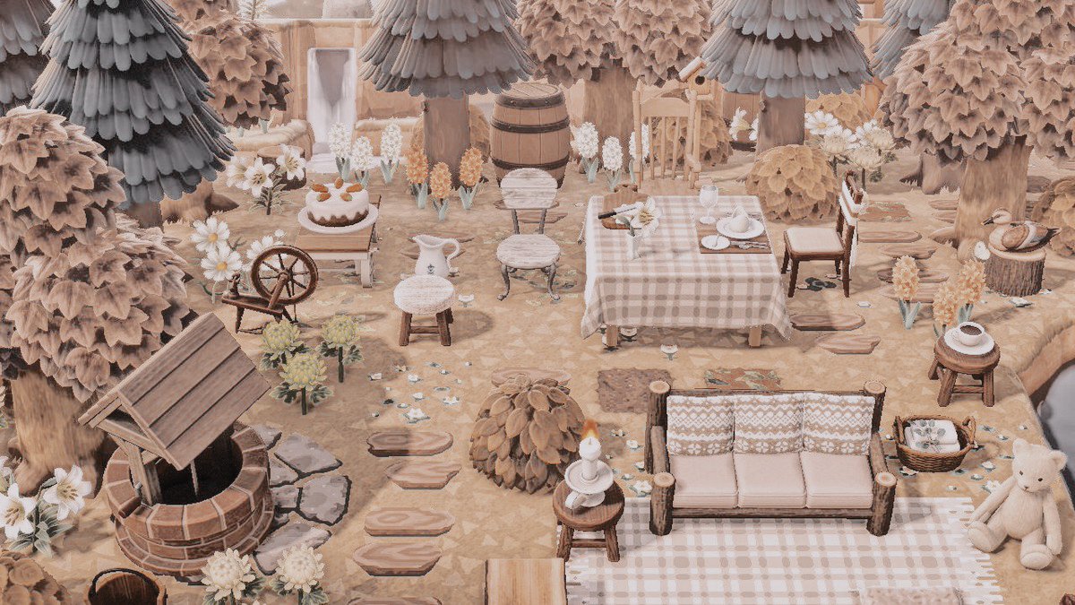
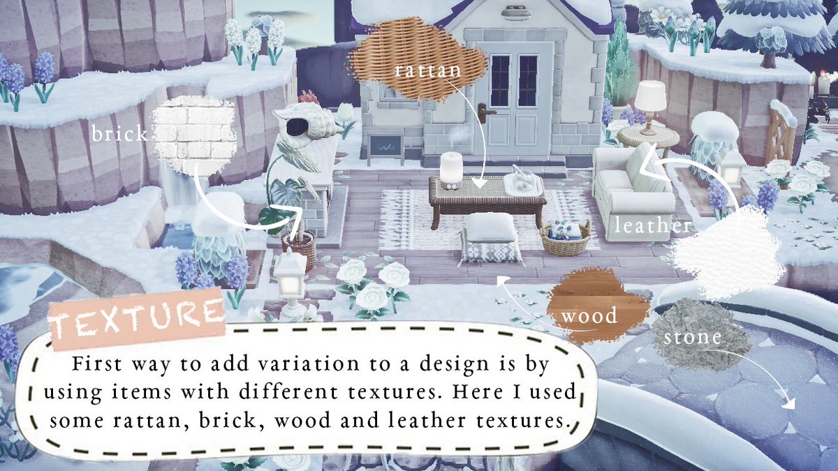
⠀⠀⠀⠀⠀ ⠀⠀⠀⠀⠀3. VARIATION: TEXTURE i always make sure to add lots of variation to an area! this can be done in many ways, including object textures. below i listed just a few of the different textures outside of olivia's house. ⠀⠀⠀⠀⠀
ANOTHER EXAMPLE * i don't just apply this to my house decorating, but everywhere!

⠀⠀⠀⠀⠀ ⠀⠀⠀⠀⠀4. VARIATION: HEIGHT it is important to me to make sure i am varying objects in height when decorating an area. trees are the easiest way to do this, but even plant objects like the monstera or cypress can add height to an area. ⠀⠀⠀⠀⠀

⠀⠀⠀⠀⠀ ⠀⠀⠀⠀⠀5. VARIATION: SHAPES this can be a bit complicated, but when i look at an object i see whether it has mostly angular edges and straight lines, or if it is very curved or rounded and use both. once you get used to it, it gets easier to tell! ⠀⠀⠀⠀⠀

EXCEPTION: * here i used lots of angular objects and straight lines because i wanted wolfgang's house to have a very bold, hard and serious vibe to it. round shapes soften the look of an area, so i chose to avoid them.

⠀⠀⠀⠀⠀ ⠀⠀⠀⠀⠀6. PLACING specifically when putting items down, i don't like to have them in a straight line (especially if they're the same colour, height, etc.). i have a cluttered style and that means no straight lines, but having a sort of 'messy' placement. ⠀⠀⠀⠀

⠀⠀⠀⠀⠀ ⠀⠀⠀⠀⠀7. NO SETS! this is a personal rule i follow, but i learned it from interior designers: avoid using too many items from the same set! if you are sticking to a colour palette you should be able to avoid making it look messy. ⠀⠀⠀⠀⠀

EXCEPTION: * sometimes i have no choice but to use items from the same set. this is okay because i can still choose different colours to make it a little less matchy-matchy, or space them out as much as i can.

aaand that's it for now! i hope you found my thread at least somewhat useful 🥺 if not, please keep an eye open for my 'design with me' thread coming soon, where i design a whole new area from scratch!! 🤗
my dms are also open if you are seeking advice on how to design or decorate a certain area. i can offer general advice or make visits to help with item choices and placements! also, if you like what i do, please consider donating a ko-fi 💙 <a target="_blank" href="https://ko-fi.com/sleepyluck" color="blue">ko-fi.com/sleepyluck</a>