@pyquantnews: The recession.The news talks...
@pyquantnews
9 views
Feb 15, 2024
1
The recession.
The news talks about it.
Investors cry over it.
And in the end, we’re the ones that lose money.
But you can prepare.
Here’s how:
The news talks about it.
Investors cry over it.
And in the end, we’re the ones that lose money.
But you can prepare.
Here’s how:
2
Analyze the yield curve.
The yield curve plots the yield of US treasuries against their maturity.
“Inverted” yield curves have been shown to reliably predict recessions.
It’s key to understanding investors’ predictions about the economy.
But what’s an inverted yield curve?
The yield curve plots the yield of US treasuries against their maturity.
“Inverted” yield curves have been shown to reliably predict recessions.
It’s key to understanding investors’ predictions about the economy.
But what’s an inverted yield curve?
3
The inverted yield curve:
• Normally, longer-dated treasuries yield more than shorter-dated ones
• The market expects the Fed to lower rates to fight recessions
• Longer-dated maturities yield less than shorter-dated ones
Let’s check it out in Python.
• Normally, longer-dated treasuries yield more than shorter-dated ones
• The market expects the Fed to lower rates to fight recessions
• Longer-dated maturities yield less than shorter-dated ones
Let’s check it out in Python.
4
Start with importing NumPy, Matplotlib, and the OpenBB SDK.
You can use the OpenBB SDK to get yield curve data for the St. Louis Fed’s data portal (FRED).
You can use the OpenBB SDK to get yield curve data for the St. Louis Fed’s data portal (FRED).

5
Then set up the bond maturities you want to use to build the yield curve.
There are conventions about which maturities to use, but there is no “right” answer.
The point is to get a good representation across the maturities.
There are conventions about which maturities to use, but there is no “right” answer.
The point is to get a good representation across the maturities.

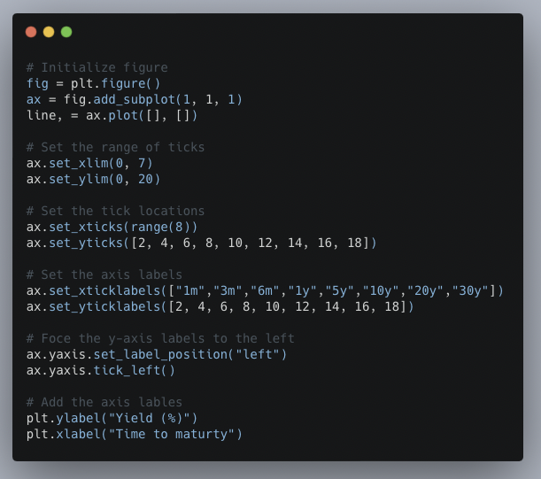
6
With Matplotlib, you can animate a chart.
Animated charts offer a great way to visualize how data changes through time.
First, set up the plots.
Animated charts offer a great way to visualize how data changes through time.
First, set up the plots.
7
Next, build the animation functions.
The `animate` function grabs the data to plot, then changes the curve color to red when the yield curve is inverted and sets the data.
The `FuncAnimation` function then loops through each row of data, creates the plot, and displays it.
The `animate` function grabs the data to plot, then changes the curve color to red when the yield curve is inverted and sets the data.
The `FuncAnimation` function then loops through each row of data, creates the plot, and displays it.

8
Animating the chart makes it easy to visualize the evolution of the yield curve through time.
You can change which maturities to use for the yield curve, adjust the time frame, and experiment with different maturities to use to define inverted.
You can change which maturities to use for the yield curve, adjust the time frame, and experiment with different maturities to use to define inverted.
9
By reading this thread:
• You have a reliable predictor of recessions
• Can get the data from the OpenBB SDK
• Animate a plot of the yield curve
All without an expensive research department or spending a dollar.
• You have a reliable predictor of recessions
• Can get the data from the OpenBB SDK
• Animate a plot of the yield curve
All without an expensive research department or spending a dollar.
10
To come back to this step-by-step guide later:
• Click the link below
• Retweet the top tweet
That's it!
• Click the link below
• Retweet the top tweet
That's it!
View Tweet